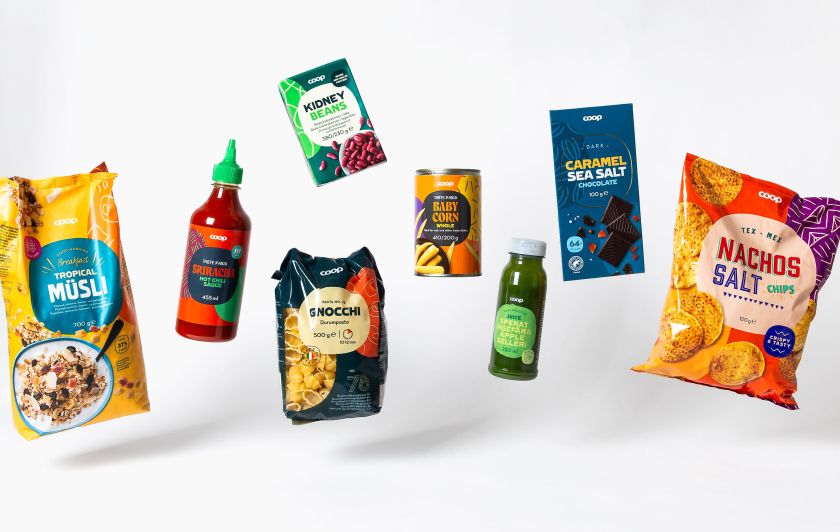
Coop Trading, the Danish company owned by four Nordic cooperatives, embarked on a mission to unify its brand across Scandinavia. Partnering with the Swedish design studio Bedow, Coop has reinvented its packaging to harmonize brand identity across Sweden, Denmark, Norway, and Finland.
A revolutionary design strategy is transforming Coop Trading’s presence in the Nordic marketplace by reimagining a staggering 3,500 products. The cornerstone of this remarkable transformation is the innovative use of a geometric figure known as the superellipse, lending a distinctive yet harmonious look to Coop’s diverse product range across four distinct markets.
Rebranding Challenge: Over 3,500 products across four countries with unique identities needed a unified design language.
Innovative Solution: The superellipse, an artistic yet mathematical shape, becomes the foundation of Coop’s new packaging design framework.
Design Versatility: The ‘plate’, derived from the superellipse, stretches across multiple product sizes and formats, ensuring brand consistency.
Customized Yet Cohesive: A flexible design system using distinct colors, typography, and imagery, allows product categories to shine while upholding the Coop brand identity.
Thousands of products, from groceries to household items, now showcase the robust design system. With close to half of the redesigns complete, Coop’s collaboration with Bedow continues to deliver an array of visually unified but category-distinct packaging, promising to ease the shopping experience for Coop customers throughout Scandinavia.
VIBING
VIBING network is Bringing Fresh Lifestyle News to You From All Over the World.