

Established as a household name, Jaffa’s transition into a visually and digitally optimized era signifies their commitment to quality and customer engagement in the fruit industry. Earthling Studio, tasked with the redesign, embraced the challenge, elevating Jaffa’s identity to celebrate their rich heritage and bright future.
- The transformation includes a new wordmark, derived from historical Jaffa logos yet crafted for today’s dynamic market.
- Digital adaptability is at the forefront, empowering the brand to create captivating content across all platforms.
- The updated identity enhances flexibility, essential for supporting Jaffa’s diversified product range and digital strategy.
Stephen McDavid from Earthling Studio explains that during the design exploration, a shared vision for a more impactful, transformative approach emerged. Shifting from mere evolution to revolution, the team uncovered a vibrant expression of the Jaffa logo that resonated with both the brand’s legacy and its path forward.
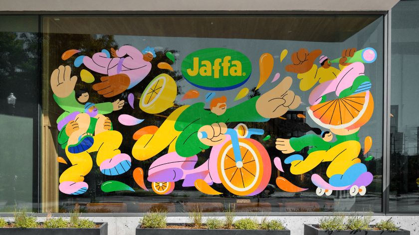
Attention to detail is evident in the refined wordmark, redesigned in collaboration with renowned type designer Rob Clarke, ensuring the logo shines in both print and pixels. The reinvigorated brand colors—vibrant yellow, green, and blue—now stand out more than ever, demanding attention and driving brand recognition.
But it’s not just about looks—The Juice Crew, characters originating from the previous branding, received a modern makeover from Brooklyn illustrator Spencer Gabor, adding playful charm and engaging narratives to the brand story.
Finally, the juicy new fonts selected for the brand resonate with Jaffa’s dedication to fresh, premium-quality fruit, emphasizing the ‘bite’ in every textual interaction. Earthling Studio meticulously crafted a comprehensive brand guideline, ensuring consistency and impact across Tesco stores and all digital mediums.


