

Step into the vibrant realm of Joonbyrd, where nostalgia isn’t just a fleeting memory but an immersive, sensory journey. Almighty’s captivating branding for Joonbyrd is reminiscent of those magical, carefree moments of the past while staying firmly rooted in the present with its scientifically proven wellness products.
- Headquartered in London, Joonbyrd is a pioneer in the beauty and wellness space, marrying emotional and physical benefits with its aesthetic appeal and science-backed formulations.
- Almighty, a full-service branding and packaging design studio, has skillfully crafted Joonbyrd’s identity to echo the luxurious yet playful essence of the brand.
- Their philosophy hinges on ‘Affective Wellness’, a fusion of emotional well-being and high-performance skincare, leading to an engaging, multisensory user experience.
Brand Evolution
Almighty has intelligently navigated the shifting consumer landscape, where deliberate spending has superseded impulse purchases in the beauty sector. They’ve reimagined beauty routines as cherished rituals, elevating them into a form of nostalgic escapism where each product serves as a portal to ‘simpler moments’ and heartfelt joy.
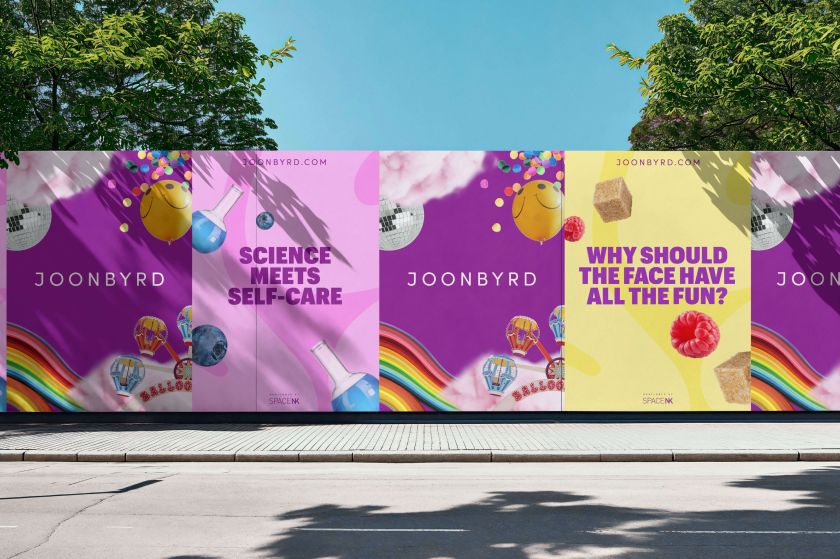
Consequently, Joonbyrd breaks away from the minimalistic norms, opting instead for a ‘credible nostalgia’ that resonates deeply with consumers. Matt Burke, creative director at Almighty, acknowledges the power of nostalgia, especially in today’s unpredictable world, where such emotions offer a comforting reprieve from the mundane.


Innovation Meets Imagination
The brand’s distinctive visuals are a deliberate divergence from the typical; instead, they are reminiscent of a psychedelic trip that beckons deeper exploration. The iconic ‘JB’ pattern, wrapping around bottles and cartons, serves as a nod to the groovy aesthetics of the 60s and 70s, while the rich, candy-coloured palette infuses a sense of play and wonder.
Packaging with Purpose
Sustainability meets style in Joonbyrd’s eco-friendly, refillable glass bottles complemented by customizable silicone sleeves. Additionally, the collaboration with Lindsey Made This for bottle charms further personalizes the user experience, echoing the brand’s commitment to joy-fueled, bespoke beauty.


