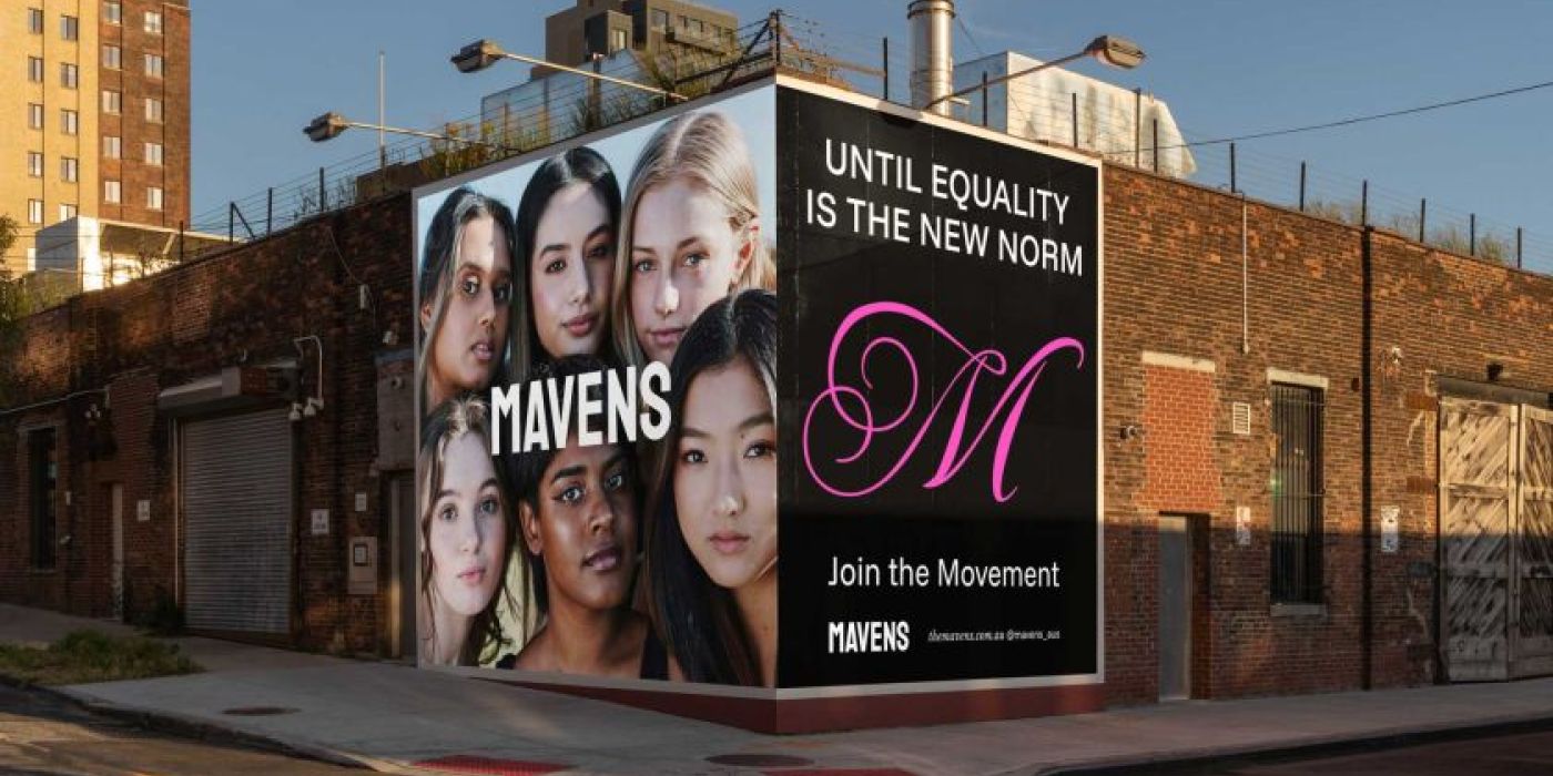
Mavens Unveils a Powerful New Identity Designed to Drive Gender Equality in the Creative Industries

The gender equality movement has rebranded in collaboration with MEK studio with a bold and unapologetic identity, shifting from commentary to action.
Mavens, a gender equality movement dedicated to reshaping the creative industries, has revealed a striking new identity designed by Melbourne-based MEK Studio. What began as an online commentary and print publication has now evolved into a fully-fledged movement that demands action, challenges the status quo, and fosters community-driven change.
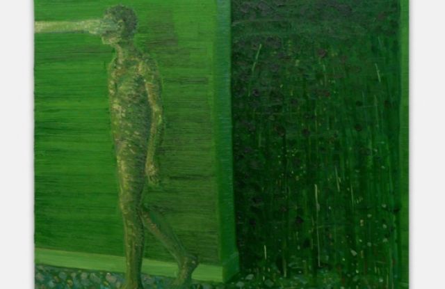
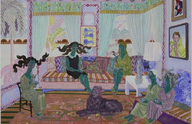
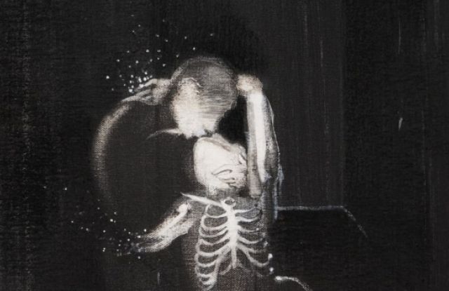
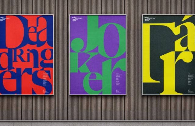
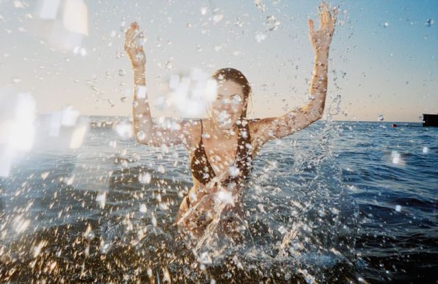
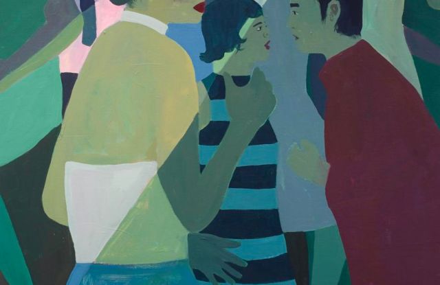
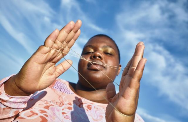
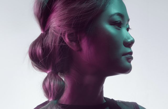
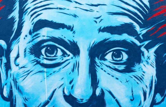
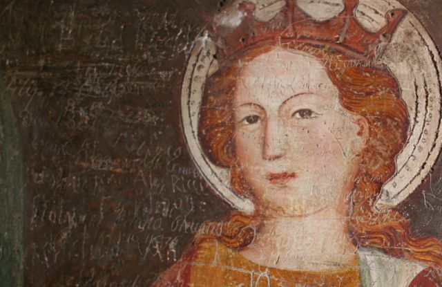
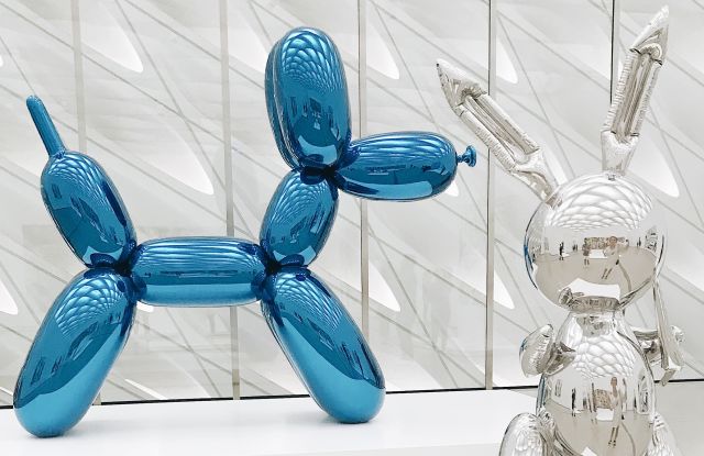
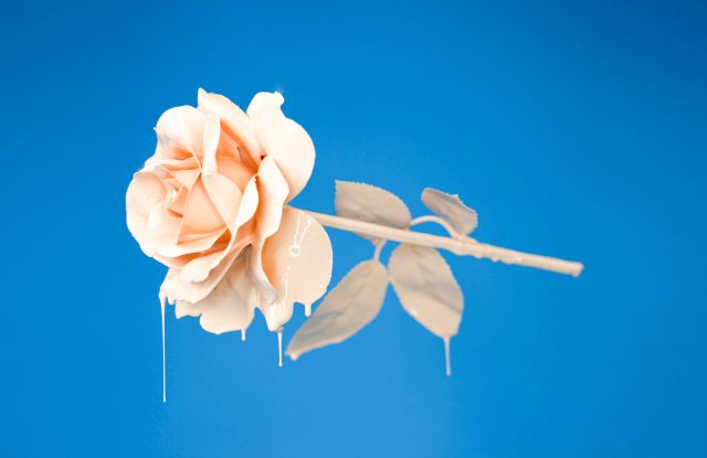
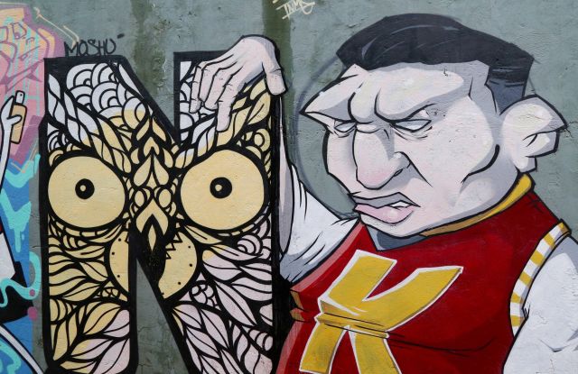
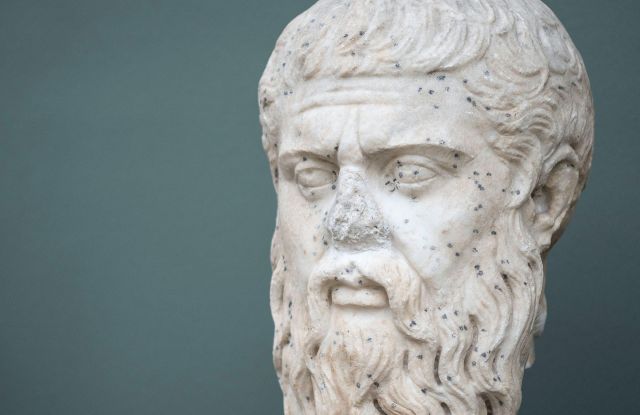
To reflect this evolution, the new branding embraces a ‘punk meets prestige’ aesthetic, balancing raw energy with authoritative elegance. Combining editorial sophistication with DIY grit, the new identity is designed to resonate across advertising, design, media, and tech while shifting perceptions of gender equality as a whole.
With women in Australian agencies still facing a gender pay gap exceeding 20%, the fight for equity in the creative industries is far from over. This rebrand moves Mavens beyond a platform for discussion to a powerful movement for change, amplifying underrepresented voices and creating space for new leaders to emerge.
For Mavens founder Leah Morris, who is also a lead copywriter at R/GA, the rebrand was an opportunity to move from talking to action.
“I think that we often do a lot of talking and not enough walking in the communications industry (after all, talking is our bread and butter), so the rebrand was an opportunity to show how we’re walking the walk,” says Morris. “Plus, gender equality isn’t a simple topic, so having a creative ‘wrapper’ to communicate its many nuances will allow us to educate the industry and help it progress in this space.”
At the heart of the rebrand is the ‘punk meets prestige’ positioning – a concept that merges editorial excellence with rebellious energy.
This fusion of disruption and sophistication is embedded in every design element. The typography takes inspiration from classic editorial design, with fonts that communicate authority while maintaining a fresh, disruptive edge.
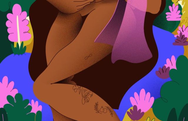
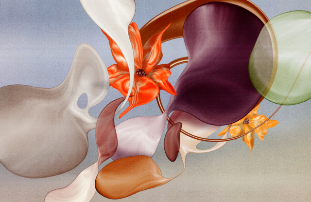
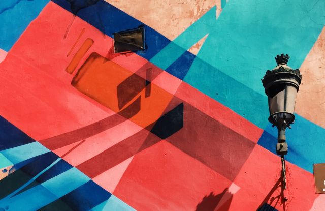
The colour palette follows a similar duality, pairing rich, sophisticated tones with unexpected vibrant accents. This contrast reflects the brand’s balance of professionalism and raw, uncompromising energy, ensuring that Mavens stands out while remaining adaptable across different applications.
More than just a visual transformation, the new identity reflects Mavens’ expanded mission—not just to support women entering the creative industries but to ensure they thrive within them.
“With our cohesive visual identity making us attractive to a broader audience, we can continue to grow our platform,” says Morris. “And our platform is effectively a mouthpiece that we can lend to anyone who is aligned with our gender equality mission and has something to say.”
“We need to rebrand ‘gender equality’ as a whole so it’s something everyone wants to get around, especially men who often perceive it as a very uncomfortable space,” says Morris.
Arapian believes that the new identity shifts Mavens from a content platform to an action-driven force.

