Crafting Authenticity: The New Identity of Somer Valley Brewing

Discovering Craft Beer with a Twist
In the heart of Somerset, Somer Valley Brewing stands apart from the crowd with a farm-first approach. Here, brewing isn’t just about ingredients; it’s about a deep connection to the land.
Utilizing regenerative farming techniques, the brewery grows its own barley, malts it locally, and draws water from its own borehole. This unique farm-to-pint philosophy has inspired a brand identity that reflects the same care and craft found in every batch of beer.
A Distinctive Visual Identity
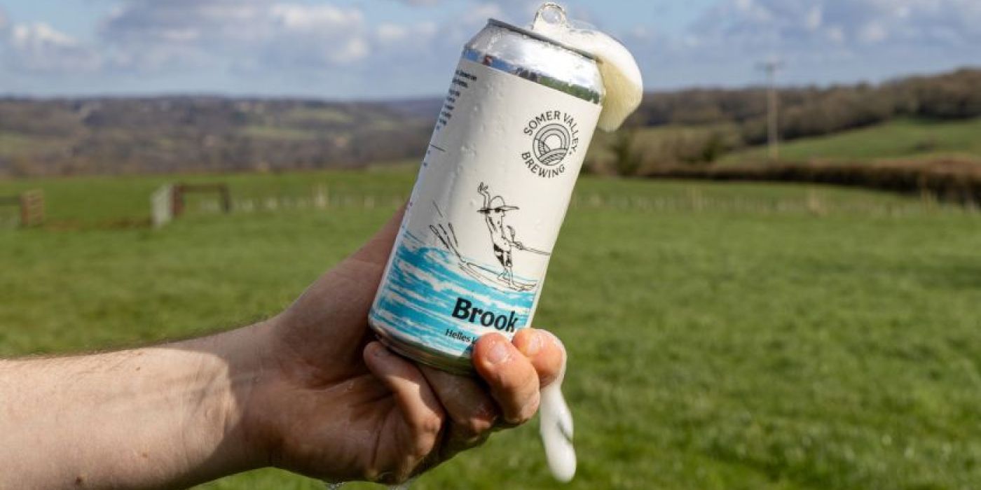
Partnering with Supple Studio and Studio Spilsbury, the brewery embarked on a brand refresh that puts the farm at the heart of its visual and verbal identity. Expect vibrant textures, whimsical illustrations, and evocative beer names.
The new logo simplifies the original landscape depiction into an organic mark, evoking the furrowed fields and sustainable practices that define the brewery’s ethos. Real-world textures—crafted from prints of hay bales, fence posts, and even tractor wheels—infuse the packaging with authenticity.
Cultivating Farmyard Charm
Renowned illustrator Simon Spilsbury injected humor and life into the brand with playful illustrations of farm animals and countryside scenes. Each beer name reflects this unique narrative, with options like ‘Snug’ and ‘Rolling Hills’ that celebrate the rural Somerset landscape.
Each label features a distinctive character, bringing an element of surprise and delight that stands out on crowded craft beer shelves. These names and visuals create a rich storytelling canvas, enhancing the consumer’s experience.
Standing Out in Craft Beer
In a market filled with chaotic designs, the challenge was creating an identity that exudes distinctiveness. The design opted for a pared-back aesthetic that balances quiet confidence with playful detail, ensuring it stood out.
Designed for Growth
As Somer Valley Brewing prepares to launch 20 new beers over the next 18 months, the brand system has been designed for expansion. A flexible system consisting of a cream background, signature textures, and unifying illustrations provides creativity without sacrificing consistency.
Extending the Identity
The brand’s new identity goes beyond packaging. From tap badges to staff tees and glassware, every touchpoint reinforces the farm-grown philosophy, wrapping them in Spilsbury’s illustrations.
After the launch, seeing people enjoy Somer Valley beers at local pubs was a fulfilling moment for the design team. This new identity isn’t just about selling beer—it’s about celebrating the rich narrative and authentic craftsmanship behind every sip.


