Fold7Design Crafts a Sun-Kissed Identity for Luxury Self-Tanning Brand St.Tropez

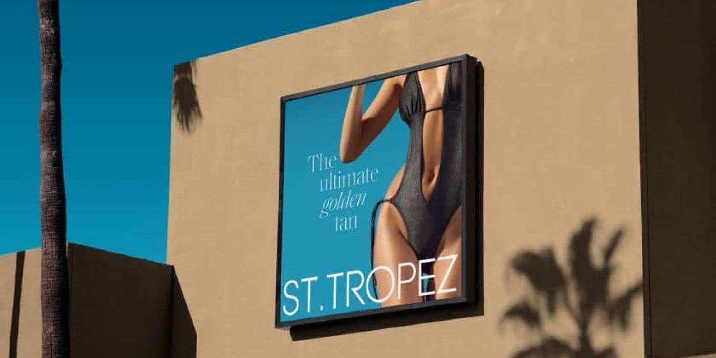
Luxury self-tanning brand St Tropez has emerged with a vibrant revival in collaboration with Fold7Design, marking a significant leap in luxury self-care. The rebrand has been devised to fend off competitive pressures while staying true to the brand’s core values of effortless glamour and indulgence. This isn’t just a product refresh; it’s a full-fledged lifestyle ambiance overhaul. Their new brand visual and verbal identity is a blend of sophistication and allure, with every detail calling to mind the escapist pleasure of a French Riviera getaway.
The reinvention hits all the right notes:
- Refined Typography: The introduction of the elegant Saol Display typeface.
- Updated Logomark: A contemporary take on an iconic brand symbol.
- Elevated Brand Voice: Sharper, more aspirational, and distinctively St.Tropez.
This visual feast wasn’t a revolutionary change but a layering of finesse. According to Tom Munckton, the executive creative director at Fold7Design, the essence was to keep what made St.Tropez iconic and intuitively recognizable, fine-tuning the elements to heighten the luxury feel. Munckton explains how the St.Tropez name itself was a goldmine of sentiment and differentiation, historically undervalued but now fully harnessed to stand out in the crowded self-tanning arena. The result is a graceful leap forward while fully embracing and accentuating the brand heritage.
The typographic treatment is a particular highlight, echoing the dynamic play of sunlight—its rise, set, and the glistening dance in between. This motion-inspired system extends a visual identity that feels fresh every time. Munckton delves into the potency of the Saol typeface, marrying large-scale readability with delicate craftsmanship to ensure premium communication that is both articulate and aesthetically stunning. This typographic overhaul does more than just speak; it dazzles with the charm and chicness of a Riviera summer.


