Harvesting Heritage: BNA Reimagines Polish Food Brand Dawtona as a Slavic Goddess

After three decades on Polish shelves, Dawtona has undergone a striking transformation defined by bold packaging, mythological storytelling, and a modern, ownable aesthetic.
In a category awash with rustic imagery and clichéd claims of farm freshness, Dawtona’s recent rebrand is trying to dig a little deeper. For 30 years, the Polish brand has been a go-to for canned tomatoes, pickles, beans and other processed vegetables. But despite being a family-run business with deep farming roots, you wouldn’t have known it from its packaging.
“The brand name, derived from the founders’ initials and the idea of producing ‘tons’ of products (Daw-tona), felt abstract and lacked a direct association with Polish agricultural traditions,” explains Martyna Biskupska, brand consultant at BNA. Combined with visually generic packaging, Dawtona’s origin story remained elusive, and its price-led positioning meant quality and heritage were often overlooked.
The challenge, then, was to shift perceptions and transform Dawtona from a commodity brand to one that proudly communicates its story of passion, family, and farming craft. BNA’s design solution sees Dawtona reimagined as a Slavic goddess of the harvest.
This new brand persona draws on local mythology and symbolism, creating a richer, more emotive identity. Far from another pastoral scene or twee market-stall motif, Dawtona’s goddess embodies nourishment, abundance and care—a figure who could only emerge from the soil of a brand with such deep agrarian roots.
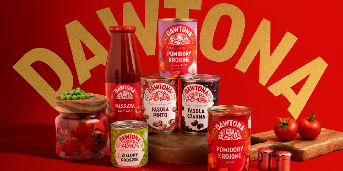
“Rather than simply reinforcing the overused ‘farm-fresh’ narrative, the rebranding drew on Slavic mythology to create a compelling persona – Dawtona, a symbol of earth, abundance, and nourishment,” says Biskupska. Now, this character appears on every pack, resplendent in a traditional Polish braid, surrounded by vibrant vegetables.
The verbal identity evolved in tandem, making more of what was once just an enigmatic brand name. Dawtona is now positioned as a character, a storyteller, and a visual anchor for everything the brand stands for. The communication strategy reinforces the story of family, farming, and authenticity.
Visually, the transformation is just as bold. Gone are the generic typographic labels; in their place is a modern, confident system that feels both fresh and rooted. The new oval-shaped lockup serves as a signature brand asset, ensuring strong shelf presence across product lines. Within this structure, each category is brought to life through its own distinct colourway.
“The colour system – bold and quite revolutionary for a mass-market shelf – was redefined to better reflect product variety,” notes Biskupska. From the deep green of pickles to the rich red of canned tomatoes, each shade is designed to draw the eye while maintaining harmony across the range.
The result is packaging that feels polished but personal, structured but full of character. It reflects the hybrid approach that BNA took to the rebrand overall: elevating Dawtona with a modern visual language while preserving its familial and cultural essence.
“Everything we did was rooted in tradition but modernised for today’s shelf,” Biskupska explains. “The harvest goddess concept gives Dawtona something no other brand in the category possesses—depth, narrative, and local resonance.”
It seems that this resonance is paying off, as the brand has already received overwhelmingly positive feedback from consumers and retailers alike since the rebrand launched. The new packaging has boosted product differentiation and shelf standout while repositioning Dawtona as a producer of quality, care-led food rather than simply a budget-friendly option.
The timing is also ripe for expansion (yes, we had to get a tomato pun in). With recent launches in juices and sauces and a clear strategy for storytelling, Dawtona is now better placed to innovate, scale, and connect with consumers beyond its core range.
Looking ahead, BNA sees plenty of scope for deepening the narrative. From sharing more of the family’s history to exploring other touchpoints beyond packaging, the Slavic goddess has opened up new creative pathways for a brand once caught in anonymity.
“We aimed to make Dawtona feel more human and relatable,” says Biskupska. “By connecting the brand to tradition through a mythological lens, we’ve created something that feels timeless, powerful and uniquely Polish.”


